Years ago I developed a watchOS app Slippery Weather (Liukkaat kadut in Finnish) displaying pedestrian slippery weather alerts to users. I sold it at the App Store, and later lowered the price to zero, offering it as a free app.
Apple Watch displaying an alert in a Slippery Weather app widget about slippery weather notification given two hours ago in the city of Oulu.
However, I didn’t have time to maintain it, so I took it off the App Store recently. That was a good decision, since I’ve now learned that the service providing the alerts API has ceased to operate.
The service got the slippery weather condition alerts from the participating cities (road maintenance folks) in Finland. It seems that the cities have switched to using Finnish Meteorological Institute (FMI) weather model based alerts instead.
I do have a prototype watchOS app using Apple Weather service local weather data. The prototype attempts to predict slippery weather for the next 12-24 hours, based on recent and forecasted temperature, precipitation and humidity. But haven’t had time to work on that either. Doesn’t work so reliably that I would want to publish the app.
Learned a lot while developing the app though. Everything lasts for their allotted time, nothing is permanent.
In an earlier post, I mentioned an issue that the deadline list rows were not updated properly while looking at the deadline coming and going. And that the solution was to do this:
@Observable
class Deadline: Codable {
// ...
   var viewUpdateNeeded: Bool = false
//...
   var isReached: Bool {
      viewUpdateNeeded = date <= Date.now
      return viewUpdateNeeded
   }
That is, to update an observed value viewUpdateNeeded to generate a change event to the @Observable so that SwiftUI view would get updated properly.
I do not know if the code above always had an issue I just didn’t see. Or did an update to Xcode and Swift/SwiftUI libraries change something. But anyways, what I did notice afterwards was this:
Start the app.
Hide the left side course list view (when the ContentView showed ContentUnavailableView since no course was selected).
In this use case scenario, everything works OK. But if I did this:
Start the app.
Select a course from the course list on the left (ContentView displaying the deadlines of the currently selected course).
Hide the left side course list view.
Then the app would get stuck, freeze totally, at step 3 (not at step 2). Why this happened is that the list row view got updated repeatedly, so that the app used 100% of the CPU.
I saw this happening when testing the app in Instruments and looking at which operation was taking the most of the execution time. Then I placed a breakpoint into that piece of code and repeated the two usage scenarios. That showed me what was happening – app was not frozen but too busy updating the list rows that it became unusable.
The reason was the line viewUpdateNeeded = date <= Date.now “changed” the value of viewUpdateNeeded from false to false repeatedly and SwiftUI then repeatedly rebuild the view. While I was in the impression that this was not supposed to be a change. Only if the value would actually change from false to true or true to false would be a change that would cause view rebuilding.
Either I had misunderstood how SwiftUI works, and my original solution did not work at all, but I just didn’t see that happening until I dit the second use case scenario with the app. Or something changed in how SwiftUI works, and then this became a bug.
Whichever, I do not know. I have no idea why this happened only when hiding the list of courses, since the course deadlines were already visible at step 2 in the second scenario.
Anyways, this change got rid of the bug:
@Observable
class Deadline: Codable {
//...
   var viewUpdateNeeded: Bool = false
//...
   var isReached: Bool {
      if date <= Date.now && !viewUpdateNeeded {
         viewUpdateNeeded = true
      }
      return viewUpdateNeeded
   }
That is, change the value of viewUpdateNeeded only when the condition becomes true.
UI testing is important, folks. Unfortunately I did not implement any automated UI testing for this app, so finding the bug was just by a chance. Regression testing is also important, to check if the app still works after updating the tools, frameworks and libraries used by the app, to catch any changes and possible issues caused by the changes there.
Apparently I like coding with the Course Deadline Counter app, now renamed to Course Deadlines app. I really, really should stop doing this, and focus on something else more acute and important — that’s why the call for help. I need to be stopped!
[I am aware of this being my own responsibility, thank you so much, so plz do not send halp.]
As a new feature, the app now has a timeline View:
Where you can view the deadlines of courses currently ongoing. The view does not show courses that haven’t yet begun or courses where the last deadline already passed.
For a student user, viewing all ongoing courses is more important, to be able to view the deadlines of the courses she is currently taking and how they relate between all the work she needs to do.
For a teacher, it is more relevant to show the deadlines to students in a single course. So limiting the view to just that one course is more important, using the drop down list at the top of the view.
Considering the needs and usage patterns of different groups of users is taught in our GUI design and programming course (Programming 4). So obviously I have to be able to do this stuff myself. Consider that done, at least in this case.
For drawing the course and course deadlines, I used the SwiftUI Canvas and for the gradient background, MeshGradient. I should still test the colors with both light and dark modes and find a usable combination of colors and an overlay to mute the colors when and if they are in disagreement with the text.
Drawing on the canvas is just simple drawing operations using the GraphicsContext, plotting the text and symbols on calculated coordinates. For example, if there are no ongoing courses, the code draws only the text “No courses to show”, in the middle of the view:
Canvas { context, size in

   var origin = CGPoint(x: 0, y: 0)
   let text = Text("No courses to show").font(.title).bold()
   let resolved = context.resolve(text)

   if coursesToPlot.isEmpty {
      // Draw info that there is no ongoing courses to show
      var textSize = size
      textSize = resolved.measure(in: size)
      origin.x = size.width / 2 - textSize.width / 2
      origin.y = size.height / 2 - textSize.height / 2
      let rect = CGRect(origin: origin, size: textSize)
      context.draw(resolved, in: rect)
   } else {
// ...
With the Picker, choosing to show all courses or just one, I searched for different solutions from the internet, and chose this one:
So there is the “show all” option where the course selection is then set to nil. Otherwise, the selection is the selected course. This enables “no selection” or as it is handled in this case, “all are selected”.
I think I got to use the Swift if expression (different from the usual if conditional statement) here the first time, handling the above picker selection:
let coursesToPlot = if let selectedCourse {
   [selectedCourse]
} else {
   deadlines.ongoing.sorted(by: { $0.startDate < $1.startDate } )
}
In plain English: if the selectedCourse is not null, let the coursesToPlot be an array containing only the selectedCourse. Otherwise, get all the ongoing courses from the deadlines, sorted by starting date ascending, and let the coursesToPlot be those courses.
The next time I touch this app should really be in the end of August or beginning of September, when I decide on the deadlines of the courses I am responsible for.
In the other news, I was today awarded as the Distinguished Teacher of the Year (again) by the study program student guild Blanko. Thank you! I am so humbled to receive this appreciation for the work we are doing here.
Three days ago I wrote about the Course deadlines app:
I list some future improvement ideas in the GitHub readme, but don’t actually know if I am going to implement those. The app already fulfills the intended purpose, so anything else would be just something fun to implement, if I have the time or motivation to do them.
And now, after three days, I’ve implemented:
alerts; the app now alerts about the incoming deadline when it becomes “hot” using UserNotifications framework,
pick a symbol; the app now has preselected SF Symbols to choose from when adding or editing a deadline,
icon; app now has an icon,
app checks that the course name and deadline goal are not empty,
app checks that the course name is unique when creating a new course, and
several GUI enhancements and bug fixes.
As if it looks like I am using the app to avoid some other (not so fun) responsibilities and instead spend time on this hobby project… Though this is related to teaching work, really!! Valid work done here!!
One of the important bug fixes was related to setting the date and time for a deadline. I use the SwiftUI DatePicker for this, specifying that I want to select both date and time, using displayedComponents: [.date, .hourAndMinute] for the picker.
I was falsely assuming that the Date object would then contain the exact date/time selected by the user. Like if the user selects, using the picker, 2025-05-15 12.00, the date object then would have that exact time. Well, it does contain that date and that time, but since the user is not selecting seconds, the date object may then contain something in the seconds, like 2025-05-15 12.00.46, for example. Not good, since now the communicated deadline is actually later than the intended deadline.
I noticed this issue when I was testing the alerts feature and saw that the actual date and time shown in the alert was not the one specified in the deadline, by the seconds.
What I needed to do was to take the user selected Date object, then set the seconds part of the date to zero and then use that modified datetime as the actual deadline date:
extension Date {
   func secondsRoundedToZero() -> Date {
      var components = Calendar.current.dateComponents([.year, .month, .day, .hour, .minute], from: self)
      components.second = 0
      return Calendar.current.date(from: components)!
   }
}
Oooh, those pesky dates and times can really be hard sometimes…
There was another interesting issue with SwiftUI and the deadline formatting. The app shows a hot deadline colored red, as in the example in this image:
A deadline coming after one day and five hours.
And when the deadline has passed, it should be grayed out, like this:
A deadline gone nine days and 17 hours ago.
This worked, when you open the app and view the deadlines just loaded from files. But if you open the app and actually watch a deadline date/time coming and passing, the formatting did not change. WTF?!
As you can see, the time is shown as relative to current time. That worked fine, but as the deadline came and passed, the relative time changed to past but coloring did not.
That was because SwiftUI updates the view when the @Observable object (Deadline in this case) changes. But the deadline object actually did not change at all. No member variables changed values when the deadline date/time comes and goes. The deadline’s date and time was still the same, of course.
The way the time is shown as relative time by SwiftUI Text element, gave me an illusion that something keeps changing. Since the view shows a countdown including seconds (when the deadline is very near) when .relative style is used:
Text(deadline.date, style: .relative)
From the SwiftUI viewpoint, nothing changed so view update was not needed, thus the formatting did not change.
I solved this by adding a property viewUpdateNeeded to the Deadline. That property was then updated in the isReached computed property…:
@Observable
class Deadline: Codable {
// ...
   var viewUpdateNeeded: Bool = false
//...
   var isReached: Bool {
      viewUpdateNeeded = date <= Date.now
      return viewUpdateNeeded
   }
…used by the list item row view:
HStack {
   if deadline.isReached {
      // Show deadline as passed
      Text("Deadline passed")
         .padding(.trailing, 0)
      // ...
   } else {
      // Show deadline as forthcoming
      Text(deadline.date, style: .relative)
         .padding(.trailing, 0)
      Text("until deadline")
         .padding(.leading, 0)
// ...
}
.foregroundStyle(deadlineColor)
Where the last line, .foregroundStyle(deadlineColor determines the color used (where the deadlineColor is a property in the deadline row view):
var deadlineColor: Color {
   if deadline.isReached {
      return .gray
   } else if deadline.isHot {
      return .red
   } else if deadline.isDealBreaker {
      return .orange
   } else {
      return .accentColor
   }
}
OK, so the initial value of Deadline‘s viewUpdateNeeded is false. When the view accesses the isReached property to decide the formatting, and the deadline is still in the future, the value of viewUpdateNeeded is set.
As the value was originally false, and the new value is still false (since deadline date is not less than current date; in the past), so from the viewpoint of SwiftUI, nothing changed and view does not need updating.
When the deadline finally comes and goes, the value of viewUpdateNeeded now changes from false to true (deadline date is smaller than or equal to current datetime) and then SwiftUI sees a change in the state of the deadline object, and now the view is updated and the also formatting changes.
Of course I knew this already. Maybe I just got confused seeing the UI changing and thought, when looking at the deadline closing: “nice, things change and view is updated” and then was astonished why the formatting did not change. After a while, looking and thinking, I realized what I already knew and then added that member variable to handle the issue.
Often we stumble with the basics, and that is OK. I remember reading from somewhere that experienced programmers actually do more mistakes than novices since they typically work faster. The difference is that with experience, you are able to spot your mistakes much earlier and are usually able to solve the issues much faster. So go gather some more experience!
Courses have deadlines. Oftentimes it happens that the deadline comes and the student work is not ready. Even though the deadlines are clearly communicated, often in several places in course materials and website. There may be many reasons for missing a deadline, but whatever the reason, missing one usually leads in to problems in passing the course.
Missing a deadline also causes extra work. Questions are asked, replies sent, and if there is a really good or valid reason, there may be an exception to the rule and extension to the deadline is granted. But if this happens often, in a course of hundreds of students, all this is extra work burdening and stressing both the teachers and the students.
If everybody gets an extension to the deadline, time after time, the concept of deadline becomes irrelevant. If one student gets an extension to the deadline, all others with the same reasons should also get it, since students must be treated equally. Therefore, it would be really, really nice if everybody would acknowledge the deadlines and schedule their work so that no deadlines are missed. A useful habit or skill to have also later in working life…
To make sure a deadlines are not missed since “I forgot it” or “It came sooner than I expected”, I started to remind students of one course about the forthcoming deadlines on my weekly Monday lecture. Since apps are cool, and I like to tinker with things, I wrote an app for this. Obviously, I could have just shown the list of deadlines from the course materials, slideshow or website, but that is boring. Also the app is yet another example of how to implement things, a demo that I can use in various programming courses and a topic for a blog post 🤓
Course deadlines app with a list of courses on the left. For the selected course, list of deadlines on the right. For more screenshots, click the GitHub link in the text and view them from the readme documentation.
The app is localized to English and Finnish, above you can see the Finnish localization screenshot, in GitHub readme, you can see the English locale version screenshots.
Each deadline has graphics and formatting to convey something about the deadline:
A symbol (trying) to convey the type of the deadline, an exam (notepad) or a programming task (hammer).
Deadlines that are “strict” (dealbreakers; will lead to failing the course if missed, others may be more flexible) are shown with an orange warning sign.
Deadlines already passed are shown in gray, and
deadlines coming soon (are “hot”) are highlighted in red.
See the GitHub readme document for examples of these. The app is actually better than a static list of text in web or slideshow in that it will dynamically format the deadlines, as listed above and shown in the GitHub readme.
The deadlines are stored, for each course, in a separate JSON file in the Documents/CourseDeadlines directory on the user’s Mac:
func store() throws {
	let storagePath = URL.documentsDirectory.appending(component: Deadlines.appDocumentDirectory, directoryHint: .isDirectory)
	deadlines.sort()
	let fileManager = FileManager.default
	let encoder = JSONEncoder()
	encoder.outputFormatting = [.prettyPrinted, .sortedKeys]
	let data = try encoder.encode(self)
	let filePath = storagePath.appending(path: name + ".json").path(percentEncoded: false)
	print("Storing file \(filePath)")
	if !fileManager.createFile(atPath: filePath, contents: data) {
		throw DeadlineErrors.fileSaveError
	}
}
The design decision here was to make it easy to share the course deadlines — just send the JSON file to anyone with this app. Or another app anyone perhaps chooses to implement that is able to read the JSON file.
With the app, user can add end edit new courses, add and edit deadlines, and also delete deadlines and courses. Although the app was originally developed for a teacher (me), it could obviously be used also by students to manage the deadlines for the courses she takes.
I did present the deadlines with one course, weekly, using this app last Fall in the live lectures. I also sent a weekly newsletter in the course Moodle space and included a screenshot of the current deadline situation in the message.
I didn’t gather any data on the impact of the app. Did students actually miss the deadlines like in any other course? Cannot say. My main motivation was to make sure no one misses the deadlines because of not being aware of them. Hopefully the awareness of deadlines was improved, and there wasn’t (too much) annoyance in being repeatedly reminded of them, time and time again 😂
There are some Apple/Mac specific things in the JSON, an example of a course with four deadlines:
The deadline date is not milliseconds from 1970 as integer (perhaps more common), but as double. The symbol for the deadline is a name for Apple SF Symbol. If implementing an app for other platforms to show the same JSON data, the developer needs to figure out a way to show something as the symbol (or ignore it). Maybe a custom drawn image or something.
I list some future improvement ideas in the GitHub readme, but don’t actually know if I am going to implement those. The app already fulfills the intended purpose, so anything else would be just something fun to implement, if I have the time or motivation to do them. One thing not listed in the readme is to provide the app also for iPhone/iPad, but since the original idea as a teacher tool used in lectures, did this only as a Mac app.
If you have any use for an app like that, or just want to use it for learning Swift/SwiftUI, the app is open sourced so just take it and use it.
A year ago I started to implement a GUI app that I could use to track the 250-300+ student projects of my Data structures and algorithms course. The motivation for the tool was to answer the question:
How can you manage four courses with nearly 1000 students when you only have two full time teachers and two part-time supportive teachers to manage all teaching, evaluating and supporting the students in their learning in all of these courses?
Me
The plan was, that using this tool, I could more easily be aware of the statuses of the many student projects in this one course. And then when necessary, do something about possible issues.
Like, knowing that a student is left behind (no commits to the project in the last week or two), gives me a possibility to ask if there is anything I as a teacher could do to help the student to proceed in the course.
And if one or several of the unit tests of the various course programming tasks fail, especially if the task was supposed to be finished already, I could go and check the reason(s). Either by asking the student or taking a look at the git repository of the student myself.
The version last year required me to run shell scripts that would automatically retrieve the up to date code of the student from their remote repository using git pull. Output was directed to a log file the app then parsed to view the content. Similarly, tests were executed in batch from shell scripts with Maven (mvn test), result written to another log file. Again, the app would parse that log file to show in a graph how the tests succeeded or failed.
A while ago I decided that I would like to integrate all the functionality within the GUI app and ditch the separate shell scripts. Also, I decided that the information about the commits and test results would be saved into a database. This way, when app launch is now much faster since it does not need to parse the various log files to show content every time the app is launched.
Instead, when launched, the app reads the repository information, git log data and the test results from a database file. App launches much faster with immediately visible data. When I want to update the commit data for all student repositories, I just press the refresh button in the app toolbar and the app starts to pull data for each repository from the remote repository URLs.
Anonymised student repositories with commit and test data.
When I want to update the test data, pressing another button (the hammer button in the toolbar) starts to execute tests that are due, saving the test results in the app database. I can also refresh an individual repo from remote or execute tests for a single project to get a quick update on the status of the student’s project.
Until now I’ve focused on getting the tabular data visible. Yesterday, I implemented a similar commit grid view you can see in a person’s GitHub profile. This color grid shows the commits visualised for all student repositories:
Commit grid visualisation,
In this grid, time proceeds vertically from up towards bottom of the grid view. Each repository is one thin column on the grid. The timeline starts from the date the course started, proceeding down.
The grid ends at the current date in the bottom of the grid. So when the course proceeds the grid gets taller. Since this course displayed here started on September, the grid here is 42 days “tall”. This will give me a very high level visual awareness of level of activity among all the students in the course.
Obviously the usefulness of the tool depends on the fact (?) that students push their commits to the remote repository often, preferably daily or at least weekly. If they do not, we teachers cannot see them and this tool does not show them. As you can see, some of the repositories are in red, meaning there has not been a commit for over 14 days. Orange repositories indicate the most recent commit being over a week old.
Red and orange colors may mean that the student has decided to do most of the course progrmming just before the deadline. A common though not the best choice. So seeing lots of red at this point does not necessarily mean big issues with passing the course. We’ll see…
I’ve been constantly trying to motivate the students to do commits and pushing often. It is beneficial for them too – you get a backup of your work in the remote, and when you need teachers’ assistance, teachers have immediate access to the code from the remote.
Since the first real deadline of the course will be after two weeks, it is time for me to start using the information from the tool:
I can easily send email to the student not having recent commits, by clicking on the (redacted) blue text where student name is displayed – that will initiate an email I will send to the student.
Clicking on the repository URL (also redacted) will open the browser and take me to the remote repository web page of that student.
Another (redacted) blue line will open the local folder in Finder for me to start looking at the student project directory on my machine.
Those repositories in blue are all OK, and (probably) I do not need to be concerned with those. Especially if the scheduled tests also pass. The purpose of the tool is to let me focus on those students that probably need attention to be able to pass the course in time.
Some implementation details:
Implemented on macOS using Xcode, Swift and SwiftUI.
Uses Core Data as the app database, with five database tables and ten relationships between the tables.
Executes git and mvn test commands in child processes using Process class.
SwiftUI Table used for tabular content.
Commit grid is draw in a SwiftUI view using Canvas and GraphicsContext.
Uses the SwiftUI redacted(reason:) function to hide student information for demonstration purposes.
Student and repository data is imported from a tab separated text file exported from Moodle. There, student enter their information and the remote repository URL in a questionnaire form. The form data is then exported as a tsv file, which is imported to the app and all student data is written to the database. No need to enter the student data manually.
…when I learned how to localise strings containing plural values using string dictionaries (.stringsdict) in Xcode.
I am working on a terminology app teachers could use to write basic terminologies about the courses they teach. Then they could share those to the students to aid in learning the course topics. Student can also add new terms to the terminology if they wish on their own devices. And even create their own terms and terminologies. Users can also share the terminologies to others.
Anyways, I wanted to localise this at least to Finnish and English. I was supervising three localisation related student software engineering projects this Spring, so I guess that also motivated me to learn more.
Anyways, I already knew from before how to do simple localisation, but not how to localise singular and plural forms of text using string dictionaries. Finally I decided to take a shot at it, and here is the result, in Finnish first. The localised text is on the left side list, on the second gray text row of each list item:
The list on the left is localised from English to Finnish, using string dictionaries to pluralise the count of elements (gray text on second line of list items). The string dictionary XML is visible in the background in Xcode editor.
Below is the English version. Note that the actual contents of the app has been written in Finnish, so the main text in first line of the list is of course Finnish – only the descriptive text (“Category has 40 terms” or “No terms in this category”) is localised. And pluralised, which was the main goal here.
English localisation of the same view.
This was bit of a fight (as usual), since the documents are there but no single document shows in one place a) how to specify the string dictionary and b) how to use it from code in SwiftUI. I managed to write the XML file using Apple documentation, but couldn’t find a usage sample there.
So I searched the internet and browsed Stack overflow. Then it came to my mind that surely I have some sample app or open source app on my machine where string dictionaries are used. So I searched from the directory under which I have all the source code:
find ./ -name "*.stringsdict" -print
And found that the NetNewsWire RSS reader app (highly recommended!) that I cloned from GitHub some time ago uses it. Then I dug into the source code and saw a sample from there. This and some stack overflow discussions helped me to finish the job.
So here is a sample of the string dictionary (Finnish version):
<?xml version="1.0" encoding="UTF-8"?>
<!DOCTYPE plist PUBLIC "-//Apple//DTD PLIST 1.0//EN" "http://www.apple.com/DTDs/PropertyList-1.0.dtd">
<plist version="1.0">
   <dict>
      <key>term(s) in category</key>
         <dict>
            <key>NSStringLocalizedFormatKey</key>
            <string>%#@terms@</string>
            <key>terms</key>
            <dict>
               <key>NSStringFormatSpecTypeKey</key>
               <string>NSStringPluralRuleType</string>
               <key>NSStringFormatValueTypeKey</key>
               <string>lld</string>
               <key>one</key>
               <string>Kategoriassa on yksi termi</string>
               <key>other</key>
               <string>Kategoriassa on %lld termiä</string>
               <key>zero</key>
               <string>Ei termejä tässä kategoriassa</string>
            </dict>
        </dict>
    </dict>
</plist>
And this is how to use it from code — the actual beef of the whole thing. All the complexity above is to make the code simple, even though you would add support for tens of different languages to the app.
First the actual Text element in SwiftUI view that shows the localised and pluralised text:
And the function categorySubTitle() that does the formatting:
private func categorySubTitle() -> String {
   let format = NSLocalizedString("term(s) in category", comment: "");
   return String.localizedStringWithFormat(format, category.termCount)
}
Simple — when you finally get the pieces together.
Hopefully I’ll get the app finished by Fall to be used by students and staff who find if useful. As a bonus, this will be a topic for a new demonstration in a GUI programming course I am participating as an assistant teacher next Spring.
There’s one potential obstacle though — seeing the new SwiftData and other new stuff coming out this week from WWDC2023 are soooo tempting….
But if I start working using those betas, I’d have to redo lots of stuff. Though since I am already using Core Data, that shouldn’t take too long. There is also the issue that then the apps (this works on macOS, iOS and iPadOS, sharing data via iCloud) would require macOS 14 Sonoma and iOS 17, and that might leave out many users who cannot upgrade or haven’t upgraded by the time courses begin… And I’d also pay some time to refactor the Java version too, that also needs some attention.
Last year I had 299 students working on their individual git projects in Data structures and algorithms course. It is a challenge to keep up with the status of each student to guide them ahead in the course!
Thinking about this today, I decided to see if I could create some tooling to help me out in keeping in touch on how students proceed in their course projects.
First tool is a bash script to clone or update the projects from GitLab to my local computer. These scripts were written already 2-3 years ago.
Second (new) script goes through the student repositories on my local computer and creates a git log file for each project, with some specific settings:
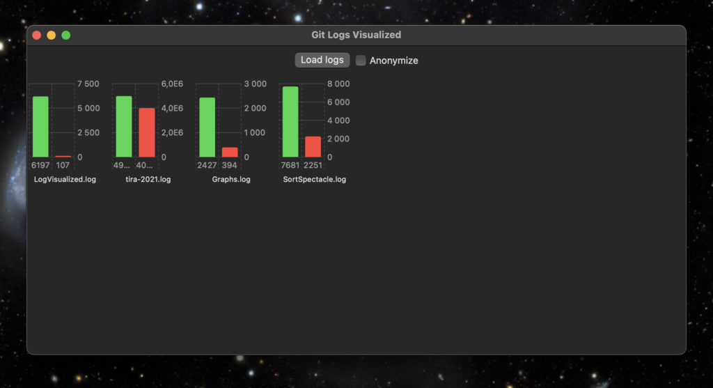
Then I have this Swift/SwiftUI app using the new Swift Charts API to generate a status view for all the student projects from the log files. When I press the Load logs button, all project log files are parsed and simple statistics for each repository is then created from the log files.
My tool app and visualisation of some of my own projects
The green bar shows the number of added lines of code so far, the red one shows the number of removed lines of code.
Anonymize -button puts random strings in place of the repository names, in case I need to show the statistics to others that are not supposed to see the student id’s.
Tomorrow starts this Fall implementation of Data Structures and Algorithms. Let’s see if this tool is of any use to us teachers…
When this basic functionality works, I could also add a line chart showing a timeline of individual projects, how lines of code were added when the course proceeds.
Due to the corona virus pandemic, I’ve been working remotely since the end of February. I felt like having a cold and isolated myself before the University officially recommended that to the personnell. Not having the virus though, but a common cold only. Obviously I cannot be 100% sure since there are no tests available here unless you are critical workforce or seriously ill. So keeping myself isolated just in case, at home.
Luckily the grocery nearby delivers food and their app and website to create the orders works quite well. Today the second delivery is arriving, which should be enough for a week at least. They have a very high load of orders flooding the service. What I usually do is to create an order with a couple of products, select the delivery date about one week later, and then keep filling the order until the day before the delivery. By this day, I already have the next delivery date reserved, with a new growing list of items to order. In this way, we am able to secure the deliveries so that there will not be too long gaps in between.
Since the isolation started, I have continued to offer video sessions via MS Teams and Moodle discussion and chat support to the students in the Software architectures course. Fortunately, the course lectures and exercises were mostly over by the isolation started. Students continue working on their exercise work projects until the end of May. Luckily I have a fast network at home, and even better hardware than at the campus. That large iMac screen has proven to be quite a good a thing to have. Currently I am recoding audio feedback for the first phase of the exercise work projects to the students. The amount of feedback to give could be quite extensive, and text feedback is inferior to audio, in my opinion. Video in this case is not needed since I can easily pinpoint the things I comment by addressing the chapter titles and paragraph and page numbers. Let’s see how this works.
The study program and the research unit are using Zoom video sessions to keep in touch and organize during the pandemic. Probably this will last until summer, but I suspect there will be limitations and exceptional situation even in the Fall semester. Time will tell. University support staff has increased the online training of teachers, providing courses in Zoom on using Moodle, Teams and Zoom itself in teaching.
I’ve started to implement a small app with Swift to learn something new. The app is also something to use as a demonstration in Fall in the Data structures and algorithms course. I will take charge of that course after the summer break, so wanted to do something related to the topic.
Below is a demo video of the app in the early phases. I am planning to implement maybe a couple of more sorting algorithms and improve the graphics and usability of the app. YouTube is full of these kind of videos, so I will not put too much effort on this, like implementing tens of different algos.